
Something my branding clients often ask me when receiving a colour palette containing colour values is “What do I do with all these numbers now?”
Normally, unless you’re creating the designs yourself, the colour palette and colour values are simply something you pass on to graphic designers or web designers to ensure they use the correct colours when creating on-brand artwork for your business. If you’re new to design or are doing a little research on how to become a graphic designer, this blog could be useful for you, too.
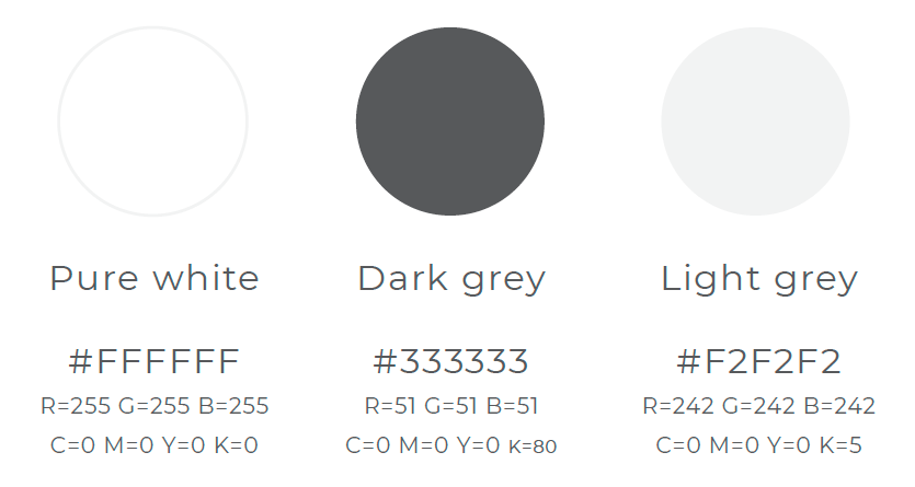
An example colour palette including colour values
Designers become used to referring to colours in different ways depending on the nature of the project; it’s become second nature, as it’s something we deal with in our jobs every day when creating colours using design software.
Here I have outlined a basic explanation of the different types of colour standards used in graphic design, and where you or your designer will want to use them:
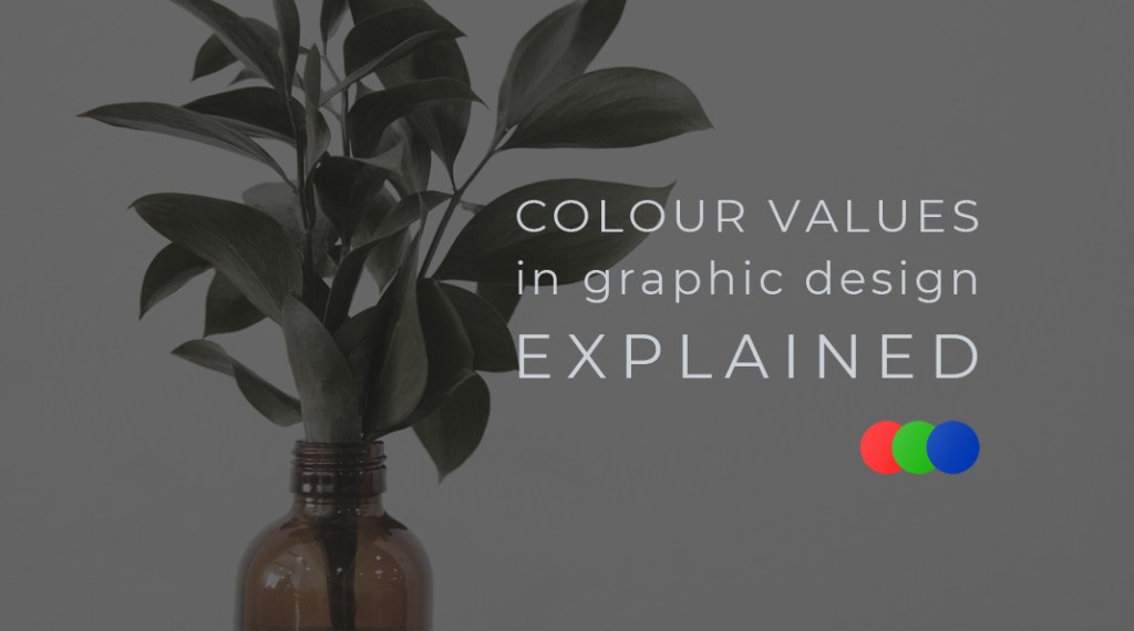
RGB
RGB stands for Red, Green and Blue. Any colour you create using RGB is made up of a mix of these three colours and represented with numbers between 0 and 255. For example, a pure bright red RGB value would be R=255, G=0, B=0 – no green or blue, only pure red.
RGB is the traditional choice for digital colours: screens, monitor displays, camera screens, websites, and digital graphics. You wouldn’t use RGB colour values for printing because they won’t look the same as on a screen.
Hex Code
An alternative to RGB is hex code. Hex codes begin with a hash tag and are followed by a combination of 6 numbers and letters. The first 2 represent the amount of R (Red), the second two represent the amount of G (Green), and the final two represent the amount of B (Blue). The bright red mentioned above (R=255, G=0, B=0) when converted to hex code, would be #FF0000 – FF is the value used to represent the same as 255 in RGB i.e the highest value. 00 represents the lowest value.
CMYK (aka 4-colour)
Standing for Cyan, Magenta, Yellow and Key (black), CMYK works in a similar way to RGB – it is simply a combination of the different colours represented through numbers. Think back to primary school; how would you create the colour red? You would mix yellow and pink together! Therefore, a bright red CMYK value could be C=0, M=100, Y=100, K=0 – an equal mix of magenta (pink) and yellow.
CMYK colour values are used for commercially printed items such as brochures, vinyl banners and magazines. CMYK colours will therefore not look accurate on a standard computer screen (which displays colours in RGB) and may print out differently than they appear on-screen.


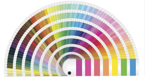
Pantone (aka PMS or Spot Colour)
Pantone differs from the other colour types in graphic design because it is an industry standard; you can trust Pantone to print accurately. Pantone swatch books are a popular tool for Graphic Designers because they show what the Pantone colour will look like when printed – no need to worry about them looking different on a screen like with CMYK! Plus, Pantone colours can be converted to RGB or CMYK colour values so that you can have the same colour standard across all of your print and online materials. (You can’t rely on converting CMYK and RGB to an exact Pantone if you find you need it at a later date!) The only factor to keep in mind is the type of paper you are printing on, as the paper surface can have an effect on the appearance of a colour. The Pantone swatch books contain colours for different types of paper to overcome this hurdle. Because of the nature of Pantone being a single colour, printed items such as photographs can’t be printed using Pantone (hence it also being referred to as a Spot Colour) but photographs can be printed in CMYK or viewed on-screen in RGB.
Often, for the best quality print, Pantone can be commercially printed on top of a CMYK print to ensure the best combination of accurate colour and flexibility.
To summarise, if you need colours for any digital images or websites, use RGB or Hex Code. If you are printing materials commercially, use CMYK. If you need a single colour (for example in your logo) printing in exactly the right shade, use Pantone, however this will be more expensive.
A good alternative option to printing with Pantone is to use the CMYK equivalent to the Pantone you would like. For this reason, when choosing brand colours it is good practice where possible to only look at Pantone colours even if you don’t intend to use Pantone for your print; it can be converted accurately to CMYK and RGB/Hex Code values.

Leave a comment